



The colors of summer 2026 From shades of blue and purple to tomato red, it's time to play with colors
Beige, greige, pale butter, light cream, barely off-white, a few earthy browns, and timeless black. Is that all? Of course not. The Spring/Summer 2026 runways have decided it's time to have fun again. This summer, colors don't ask for permission. They clash, blend together, and demand attention. Prada pairs chartreuse with burgundy as if it were the most natural thing in the world, Chanel revives pink and matches it with merlot, Miu Miu falls in love with red and blue in every possible shade, while Chloé convinces everyone that butter yellow might just be the new beige. The result? A palette that looks like it came straight out of an artisanal gelato shop, an Amalfi Coast sunset, and a forgotten box of crayons left open on the table, all at once. The new mantra is no longer "matching," but experimenting.
The colors of summer 2026
Purple
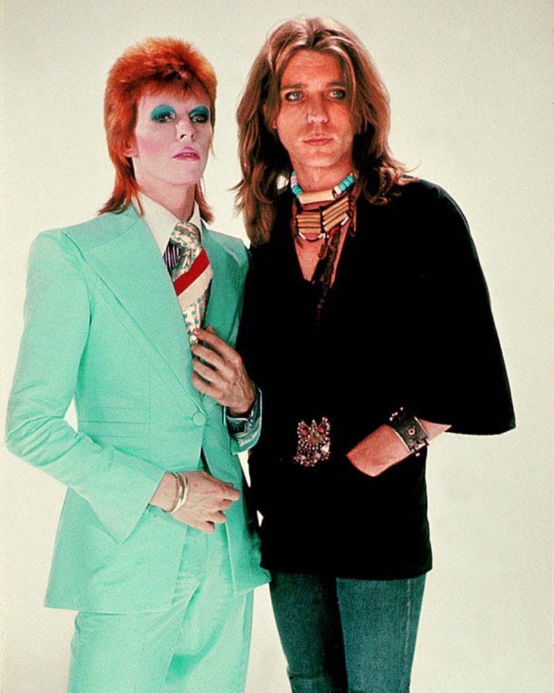
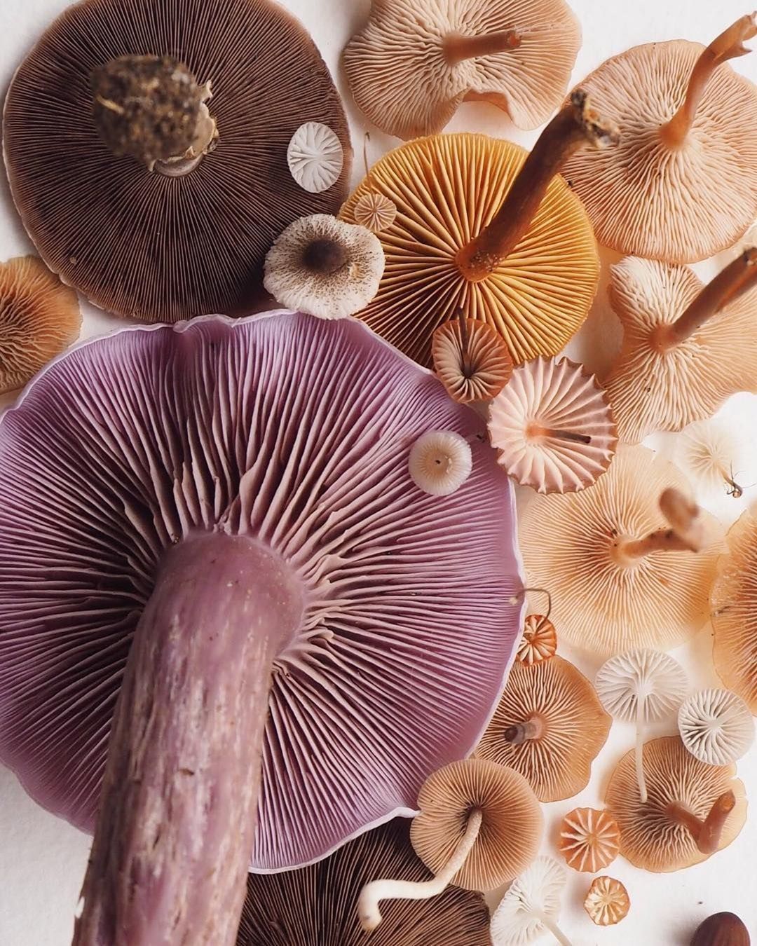
Forget romantic lilac or delicate lavender. Summer 2026 is all about deeper shades, amethyst, aubergine, and grape, that look as though they've been borrowed from a jewelry box. It's a mature, sophisticated purple that's surprisingly easy to wear.
Mood: Think of it as your most creative friend's version of black. Sophisticated, slightly theatrical, and effortlessly confident, the kind of color that walks into a room and gets noticed without raising its voice.
On the runway: Prada leads the way, pairing it with bright red in one of the season's most striking color combinations. Purple also appeared at Celine, Balenciaga, Valentino, Ferragamo, Bottega Veneta, Dries Van Noten and, Khaite, featured on satin dresses, lightweight coats, and sharply tailored suits that elevate it into a modern classic.
Pair it with: If purple once lived in black's shadow, it now prefers much more interesting company. Tomato Red creates the coolest duo of the season, as seen at Prada and Celine, but it also works beautifully with Cloud Dancer, cocoa brown, and chartreuse for those who aren't afraid of bold color-blocking.
Wear it like: At the Cannes Film Festival, Dua Lipa officially endorsed the trend in a Ferragamo total look featuring a sheer purple dress, a Hug Bag, and fiery red mule pumps. For a more casual take, Zoey Deutch paired a purple cardigan with poppy-red trousers, proving that the "grape and tomato" combination works just as well off the runway.
Tomato Red
Remember Cherry Red from 2025? Tomato Red is its version after returning from a week on the Amalfi Coast. Warmer, richer, and unmistakably Mediterranean. It evokes tomatoes bought fresh at the market, aperitivos that begin at six and last until sunset, checkered tablecloths, and pasta al pomodoro enjoyed with a sea view. It's impossible not to notice, and even harder not to feel instantly transported into summer.
Mood: Energetic, sensual, and incredibly optimistic. It's the color that turns even the simplest tank top into the star of the outfit.
On the runway: from Chanel a Loewe, with Valentino, Hermès, Ferragamo, Prada, Alaïa, Marni, Bottega Veneta and Dries Van Noten, in between, Tomato Red appeared across virtually every major fashion capital. Some designers embraced it in head-to-toe looks, while others used it as an accent, letting it brighten handbags, sandals, and summer coats.
Pair it with: Purple is already a strong contender for the color combination of the year, but Tomato Red also shines alongside Cloud Dancer, natural browns, and icy blues, creating a crisp contrast with unmistakable Mediterranean charm.
Wear it like: Hailey Bieber continues to embrace it in accessories and mini dresses, while Kendall Jenner, wears it in street style through crimson tailoring and poppy-red accents. Translation? Red has officially left the runway and made its way into celebrities' wardrobes.
Lime Green and Chartreuse Green
There’s always a color that, as soon as it appears on the runway, makes you think, “No, this will never catch on.” Then six months go by, and you find yourself searching for “chartreuse cardigan” on Vinted at 2 a.m. In 2026, that color is lime green. Or rather, its more sophisticated cousin, chartreuse. Credit goes to Prada, which has pulled off the feat of transforming the color of Stabilo highlighters into one of the season’s chicest shades.
Mood: ironic, experimental, and a bit irreverent. It’s the perfect color for those who see fashion as a game rather than an exercise in mimicry.
On the runway: In addition to Prada, chartreuse appears in the collections of Miu Miu, Loewe, Balenciaga, Dries Van Noten, Saint Laurent, Tibi, Ganni, Alaïa and Staud, especially on slip dresses, lightweight cardigans, bags, and details capable of revolutionizing even the most minimalist look.
Pair it with: Pradaplays with peach, brown, and Millennial Mint. If you want something simpler, try it with cobalt blue, Cloud Dancer, or a rich cocoa brown. The result will be far less intimidating than it seems.
Wear it like: Elsa Hosk continues to prove just how well bold shades work with minimalist accessories, as does Emili Sindlev, the queen of Scandinavian street style, who pairs them with slip dresses and leather jackets, or Marianne Smyth, who pairs a simple T-shirt with satin taffeta pants in shades ranging from lime green to chartreuse. And how could we not mention the looks from the 2026 Met Gala by Alexa Chung and Sarah Pidgeon?
Orange
Not the neon orange of the 2010s, nor the vibrant mandarin of the Y2K palettes, but a warm shade that shifts between terracotta, tangerine, and freshly squeezed orange juice. It’s the color that turns any outfit into a postcard.
Mood: It has the energy of a vacation just beginning. Sunny, warm, and spontaneous, it’s one of those colors that instantly puts you in a good mood, even in the city.
On the runway: Hermès, Ferragamo, Jacquemus, Dries Van Noten, Gabriela Hearst, Proenza Schouler, Tory Burch and Bottega Veneta interpret it in a sophisticated way, featuring flowing dresses, linen suits, and ultra-soft leather. The final effect is more “relaxed luxury” than a burst of vibrant energy.
Pair it with: An interesting combination is with Cloud Dancer, camel, cobalt blue, or turquoise, for an effect reminiscent of the colors of the Italian Riviera.
Wear it like: In recent months, London-based stylist, trendsetter, and content creator Monikh Dale has often opted for warm shades paired with neutral or earthy tones, while Zara Larsson prefers a brighter orange to mix with other neon colors.
Butter Yellow and Citrus Yellow
Anyone who thought Butter Yellow was just a passing trend in 2025 will have to think again. Yellow continues to dominate SS26 as well, but it does so in two distinct forms. On one hand, there’s butter yellow, delicate and creamy, which now plays in the same league as beige. On the other hand, there’s citrus yellow, saturated, vibrant, and decidedly bolder, perfect for those who want to add a dose of energy to their wardrobe. It proves that a single color can have two completely different personalities: one relaxed and sophisticated, the other playful and almost pop.
Mood: Butter Yellow is Sunday morning brunch, crumpled linen, and a cappuccino sipped in the sun. Citrus Yellow, on the other hand, is an iced limoncello, a convertible with the windows down, and a summer playlist blasting through your headphones.
On the runway: Butter Yellow continues to take center stage thanks to Chloé, Tory Burch, Jil Sander, Alaïa, Max Mara and Fendi, where it adorns loose-fitting suits, airy trench coats, and boho dresses. The more intense version, on the other hand, appears in the collections of Prada, Miu Miu, Chanel, Versace, Gucci and Bottega Veneta, often through details, accessories, or head-to-toe looks that seem to capture the light.
Pair it with: Butter Yellow is in a love affair with Icy Blue, one of the season’s most elegant combinations, revived by Chloé and Tory Burch. Those who prefer a more minimalist look can pair it with sandy browns or Cloud Dancer. Citrus yellow, on the other hand, looks its best alongside cobalt blue, turquoise, or even Tomato Red, for a color-blocking effect that evokes the Italian summer.
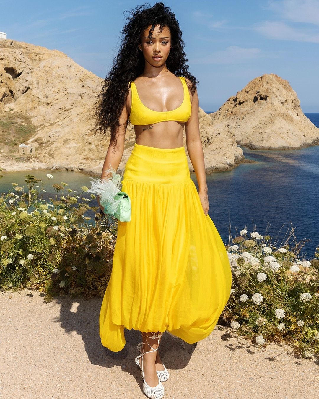
Wear it like: Ella Bright of Off Campus wore a pale yellow mini dress on The Tonight Show, while Manon Bannerman of Katseye attended the Jacquemus SS27 fashion show in a bright yellow bra top and a flowing midi skirt.
Light Pink
Barbiecore? That’s ancient history. The Light Pink of 2026 has nothing to do with the hot pink of recent years. It’s a powdery, ballet-inspired pink, barely there, that looks like it came straight out of a classical dancer’s wardrobe but is reinterpreted with a decidedly contemporary sensibility. It’s delicate, yes, but not fragile. In fact, the runways are using it precisely to create contrasts.
Mood: romantic without being affected. It has that understated elegance of someone who doesn’t need to raise their voice to get noticed.
On the runway: Chanel, Chloé, Miu Miu, Valentino, Ferragamo, Khaite, Alaïa and Simone Rocha re choosing it for chiffon, satin, tailored suits, and lingerie-inspired dresses. Its strength lies precisely in its lightness.
Pair it with: Chanel pairs it with burgundy, creating an elegant and sophisticated contrast, while cobalt blue adds character without overshadowing its delicacy. Tomato Red also works surprisingly well, making the pink less romantic and much more contemporary.
Wear it like: Madonna wore it in a lingerie-inspired look for her performance in Times Square; Harper Beckham chose it to celebrate David Beckham’s star on the Hollywood Walk of Fame.
A kind of blue
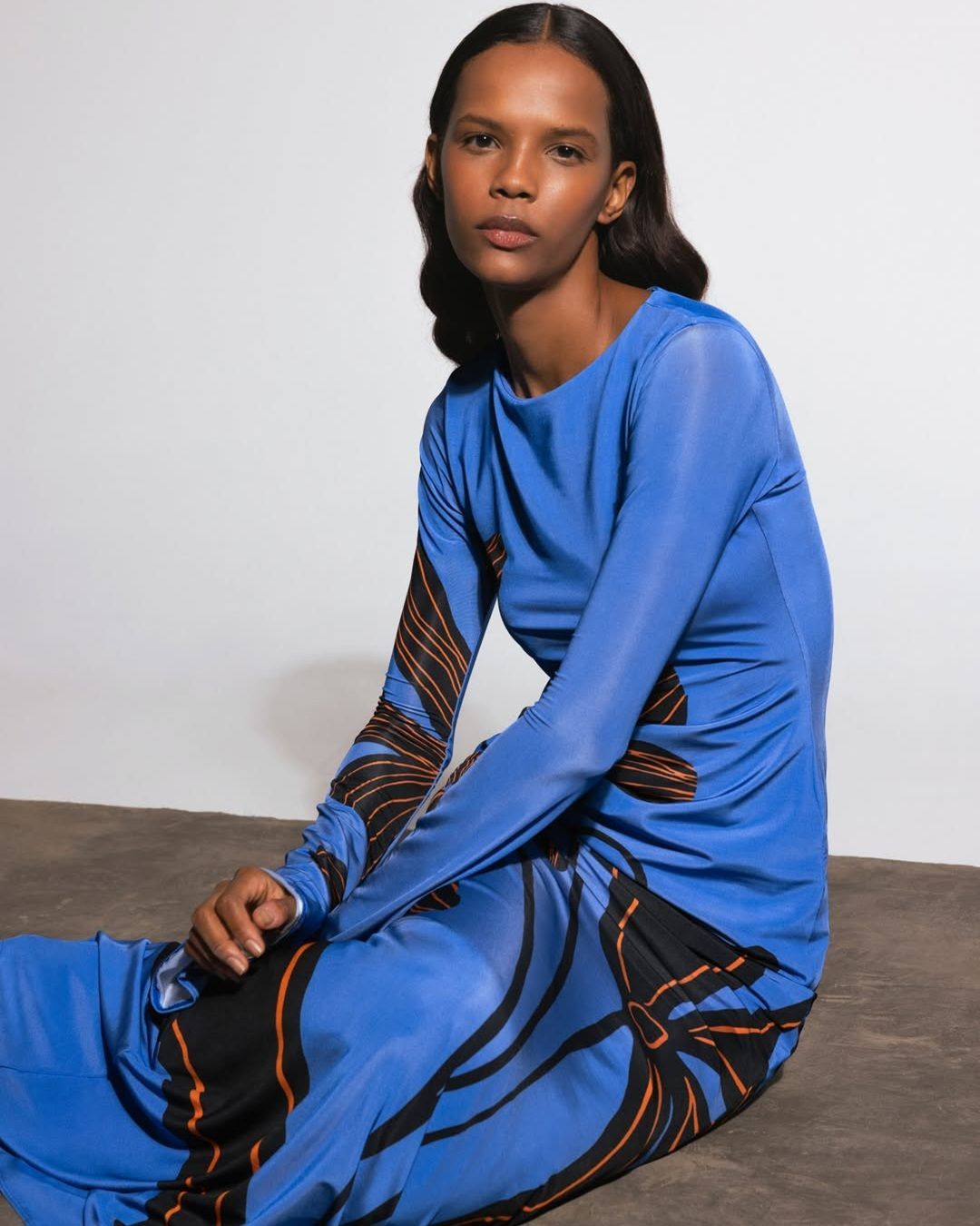
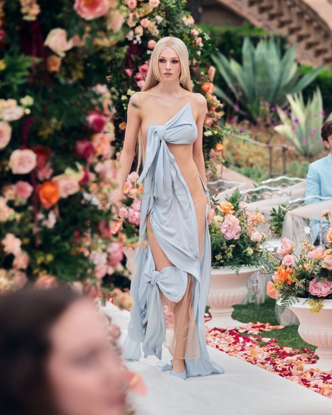
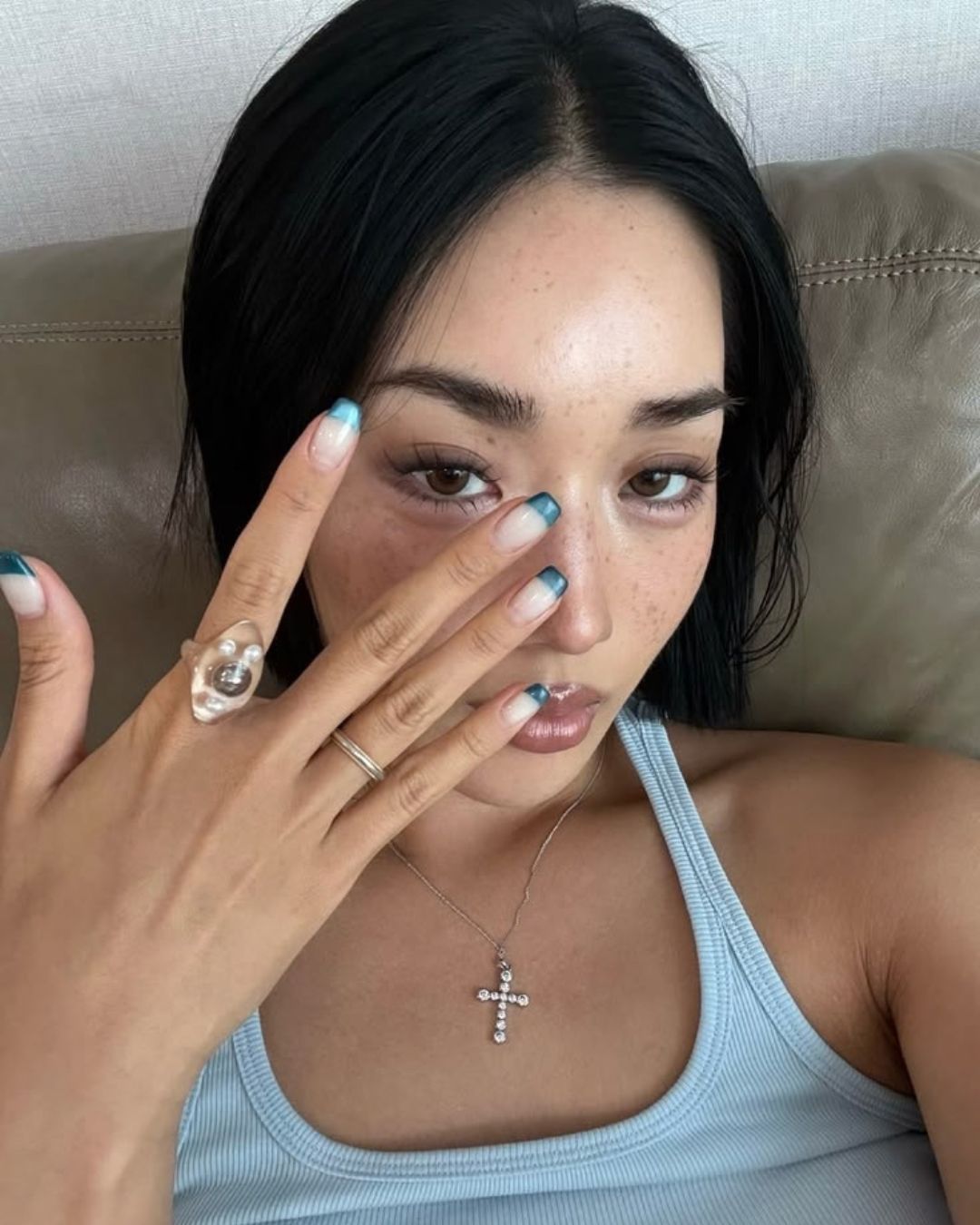
Blue dominates the Spring/Summer 2026 runways. But forget the idea of a single shade, this year, blue is constantly changing its look. There’s Icy Blue, as light as the sky on an August morning; cerulean, which already evokes beach vacations; cobalt, intense and graphic; turquoise, which looks like it was stolen from a Mediterranean bay; and dusty blue, so soft it almost seems like a neutral. More than just a color, it’s an entire wardrobe.
Mood: Every shade tells the story of a different summer. Icy Blue is the color of linen shirts and sheets drying in the sun. Cobalt has the character of someone who always orders “something strong” at the bar. Turquoise is pure wanderlust, while Dusty Blue is the elegant answer to those who think minimalism must necessarily be beige.
On the runway: Icy Blue has won over Dior, Victoria Beckham, Jil Sander, Prada, Chloé e Max Mara. Il cobalto compare da Prada, Chanel, Loewe, Givenchy and Balenciaga, , while Pucci, Missoni, Etro and Jacquemus bring turquoise back to the runway. Dusty blue, on the other hand, remains the favorite of The Row, Lemaire, and Khaite, where minimalism simply shifts in tone.
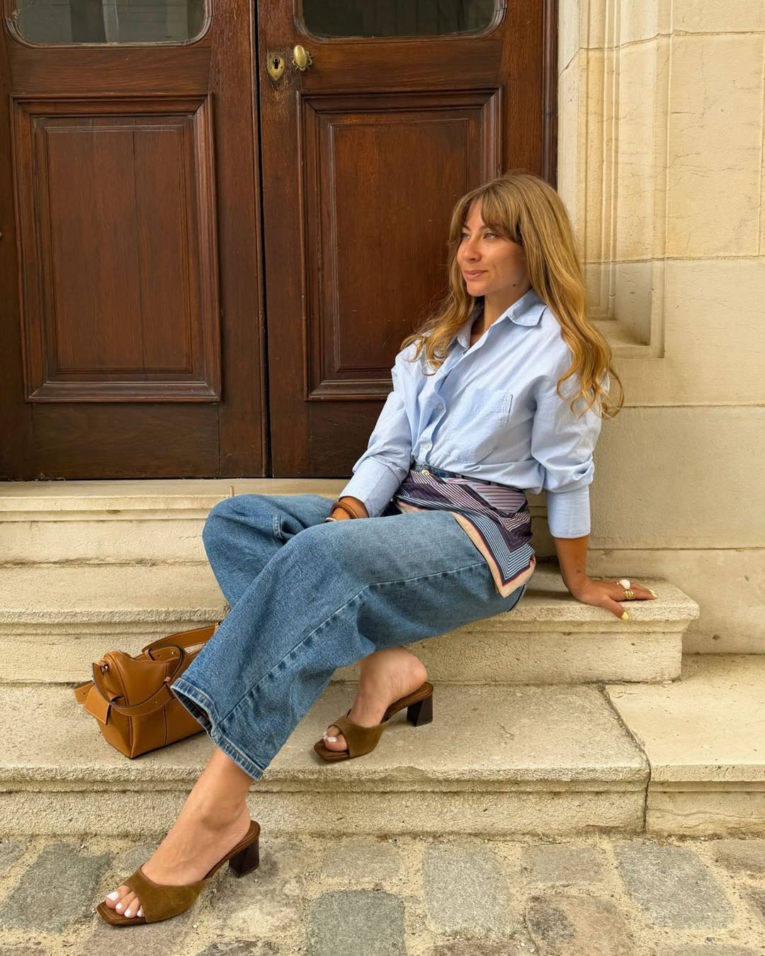
Pair it with: If there’s one color combination destined to dominate Instagram in the coming months, it’s Icy Blue and Butter Yellow, as presented by Chloé and Tory Burch. Those who prefer something bolder can opt for Tomato Red, while chartreuse makes cobalt blue even more contemporary. Cocoa brown remains the best choice for instantly making any shade of blue more refined.
Wear it like: Alexandra Leclerc wore a turquoise balloon dress to the latest Jacquemus fashion show; Millie Bobby Brown hose a vintage-inspired cerulean blue dress for the premiere of Enola Holmes 3 in New York; and Lexi Minetree swapped Elle Woods’ pink for a sparkling, embroidered turquoise ensemble by Mirchi by Kim.