


5 Decor tips for a "Very Peri" home How to use and match the 2022 Pantone Color of the Year in interior design
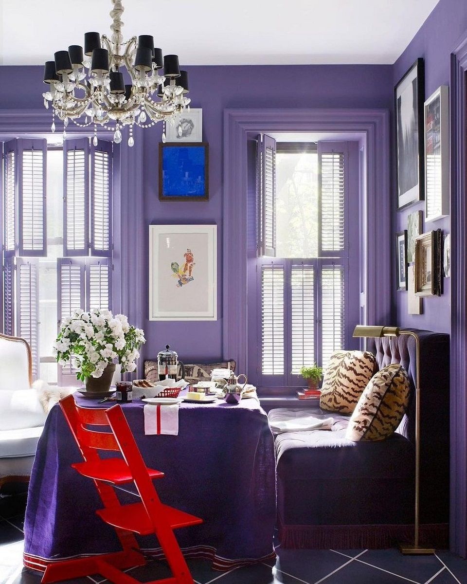
Save these two words because in the coming months you'll be hearing a lot about them and, moreover, you'll be seeing them everywhere: Very Peri. It's the Color of the Year, the shade that Pantone, tracking trends that are emerging and shaping fashion, design and even the metaverse, predicts will be the most influential in the global scenario. Its exact name is PANTONE 17-3938 Very Peri, a particular shade of purple that lies between dark periwinkle and lilac, obtained by infusing the cold notes of blue with a warm undertone of red. Created ad hoc to embody the zeitgeist of the moment, a transitional period characterized by contamination between real and digital, this color becomes the symbol of new positive modernity that invites us to express our imagination, daring and experimenting in every aspect of our lives. Not only in the outfits, as the dresses sported on the red carpet by Lady Gaga and Olivia Rodrigo are already showing us, but also in our apartments.
As explained by Leatrice Eiseman, Executive Director of Pantone Color Institute, even in furniture and interior design the Very Peri instills a sense of playful freshness, giving a new twist to the spaces thanks to unusual color combinations. Its main plus? The versatility makes it fit a range of different materials, textures and finishes. All it takes is a painted wall, a statement piece of furniture, an eye-catching print or an accessory to completely change the look of our rooms and make interior design cool and à la page.
nss G-Club has made a little list of tips to follow to have a "Very Peri" inspired home.
Palettes and matches
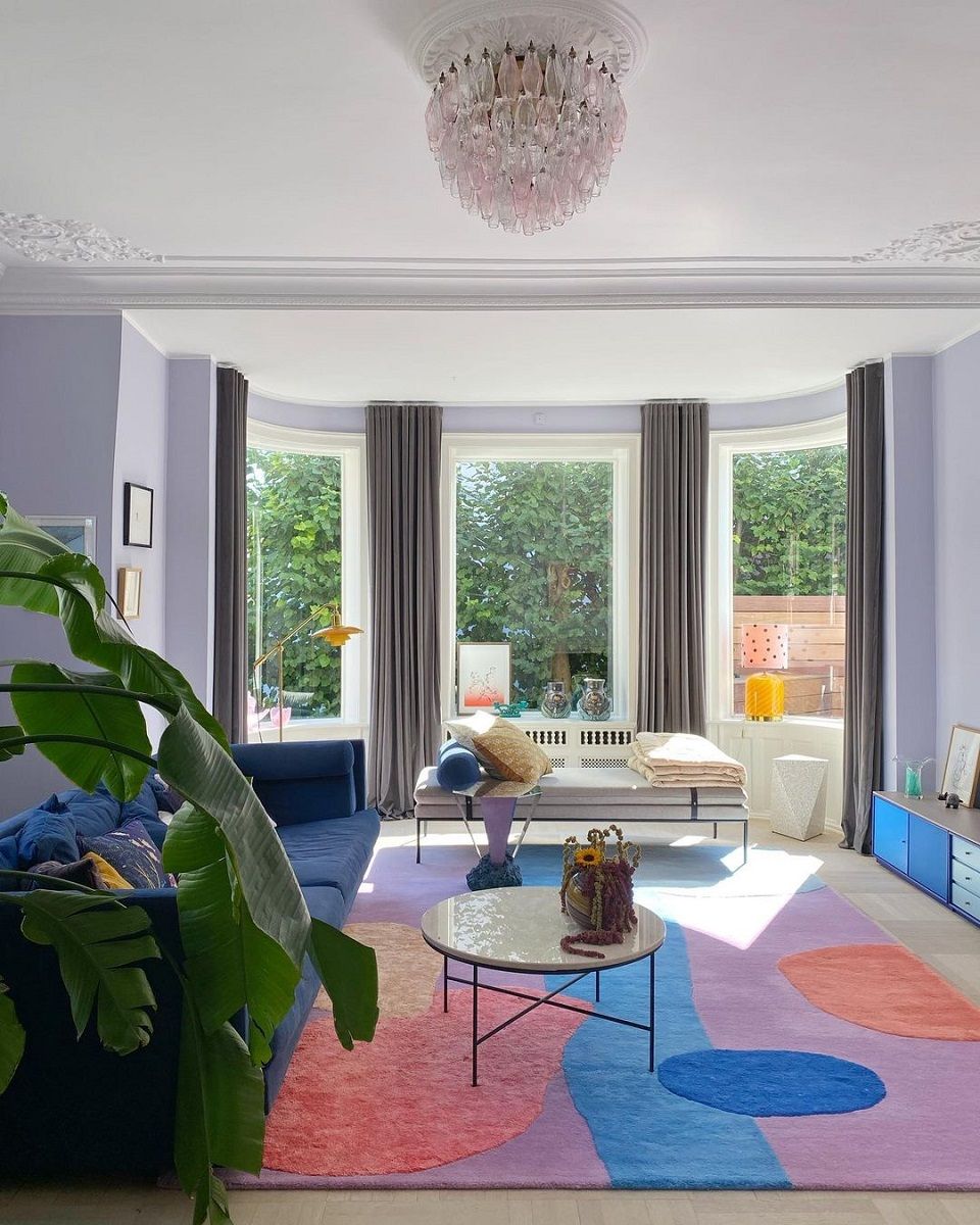
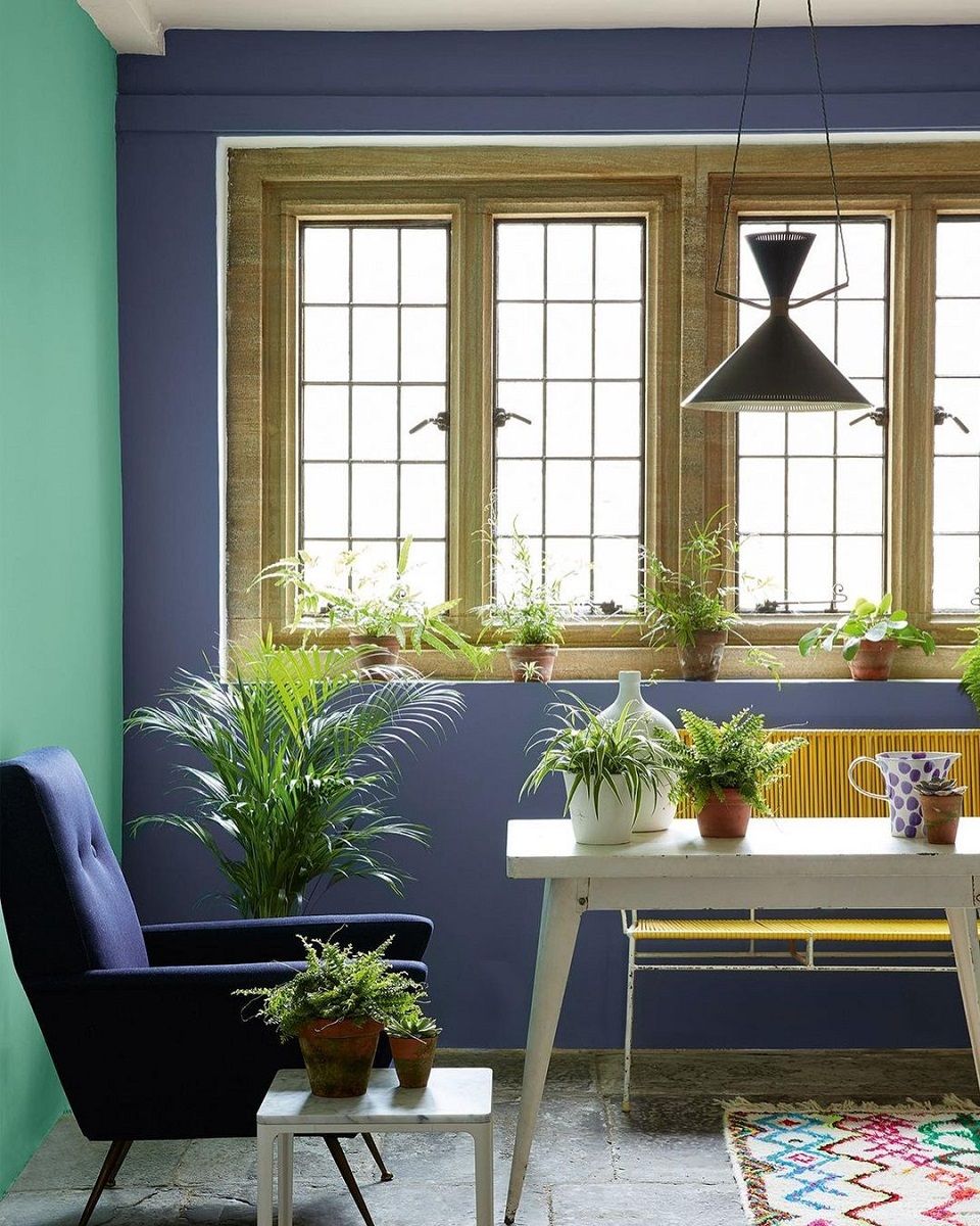
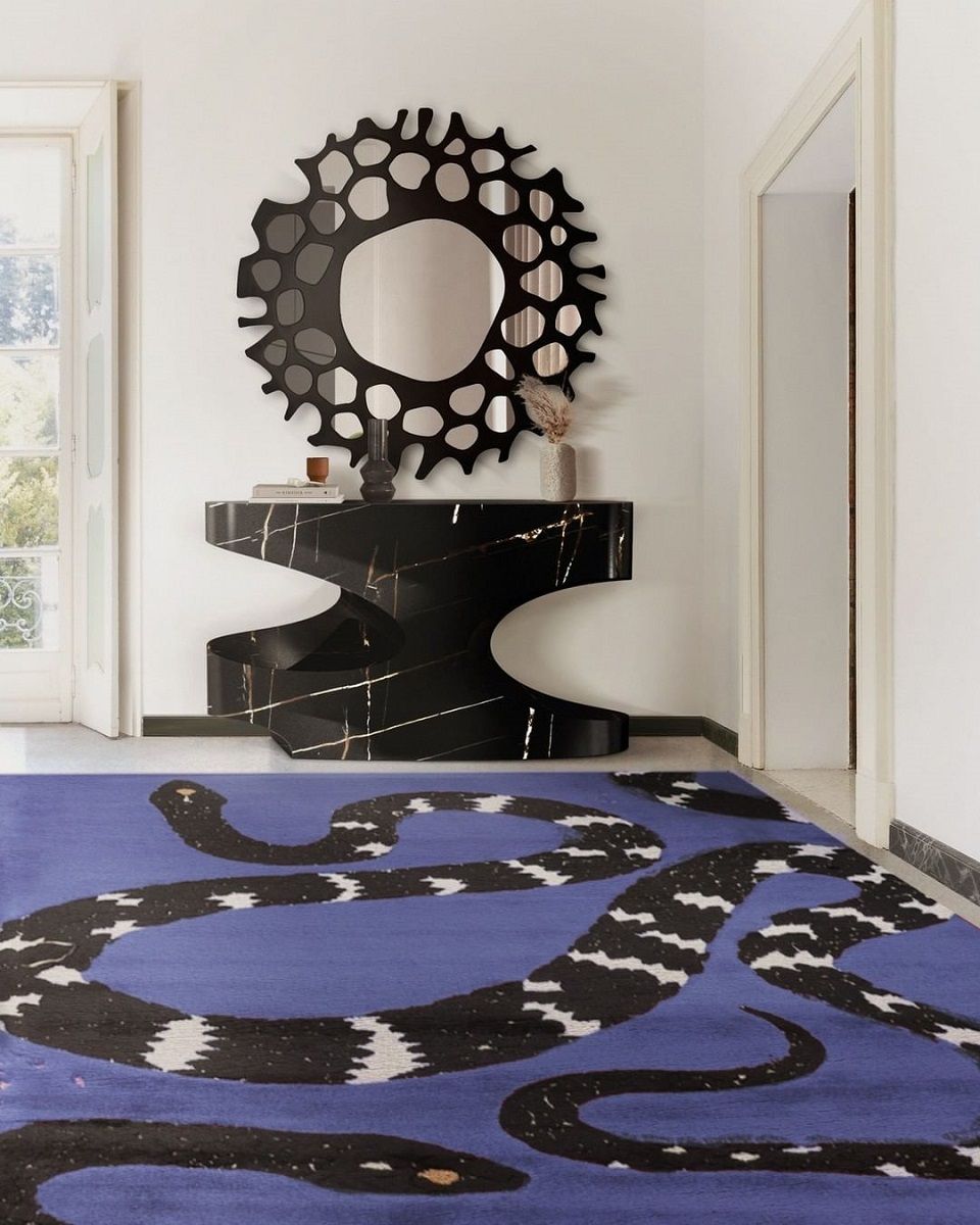
This new hybrid of blue, red and purple has the merit of matching perfectly with a wide range of shades. The easiest combination is with white and soft tones of sand, camel and beige, but the one with the warmest tones of brown, from coffee to caramel and cocoa, is also very effective. Decidedly fresher and perfect for giving a contemporary twist to the rooms of the house is the combination with green, pink and even orange and yellow. To help you make the right choice, Pantone has developed 4 different color palettes. The first is Balancing Act and includes lilac, pink, purple and granite green; the second is called Wellspring and is inspired by nature with shades such as Chai Tea, Treetop, Foliage or Eggshell Blue. The third palette is The Star of the Show, a sophisticated selection of taupe, charcoal gray or sand white. Finally, the last palette is called Amusements and it is the most joyful and funny. With its Pink Flambé, Iced Coffee, Tourmaline and Tawny Orange it is perfect for those who are not afraid to be daring.
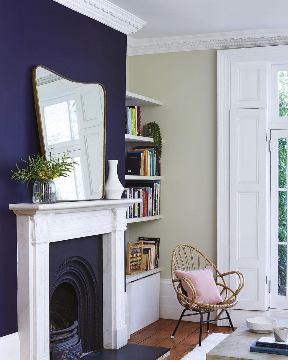
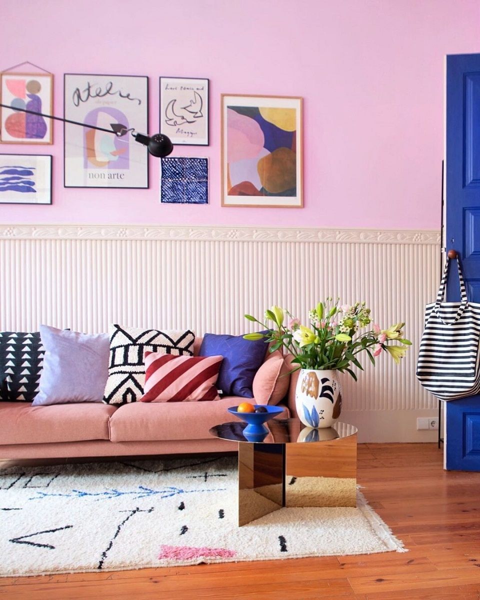
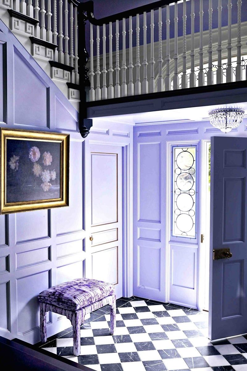
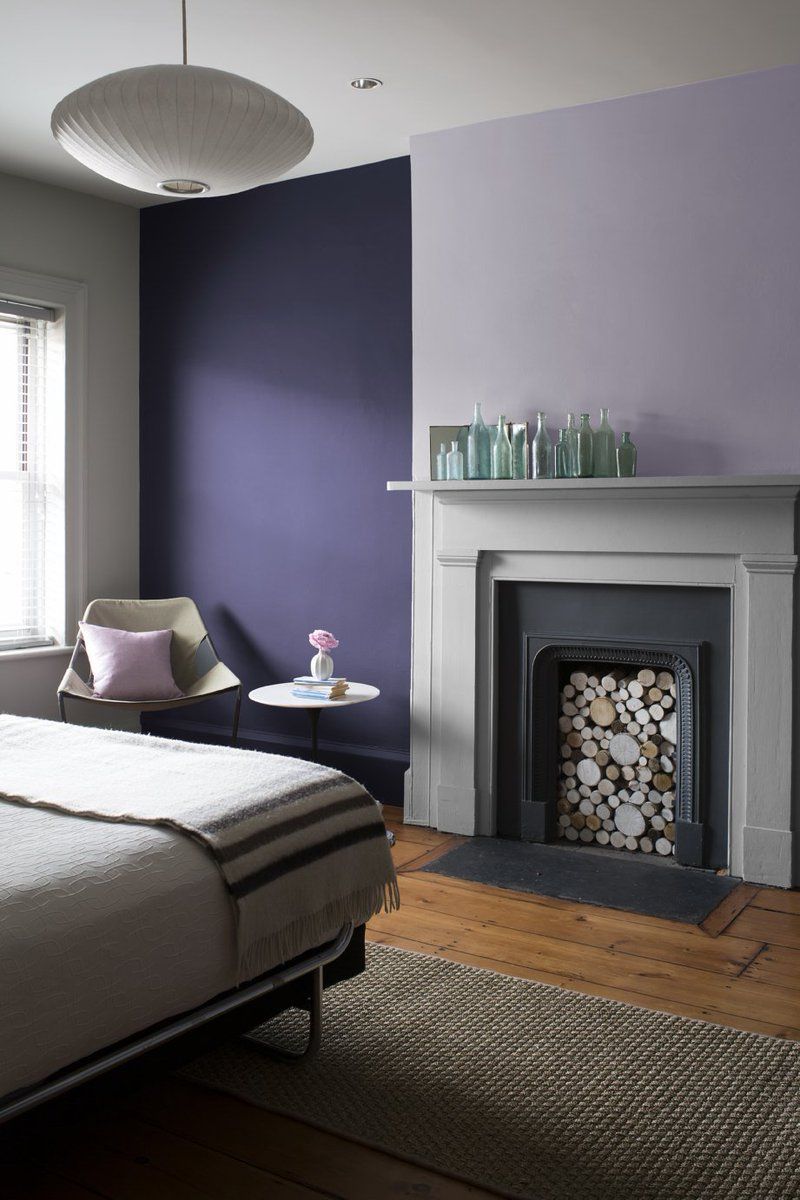
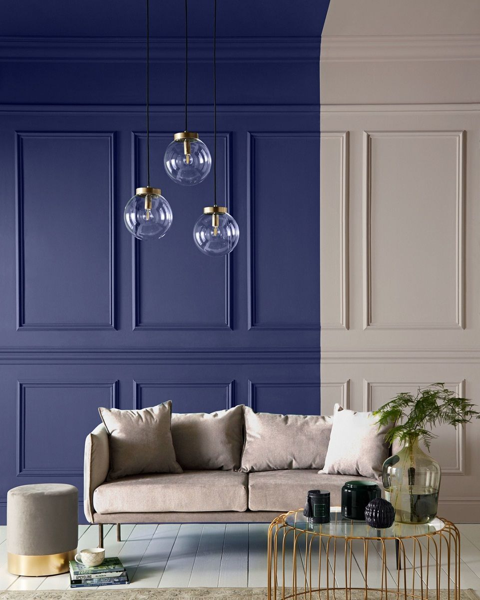
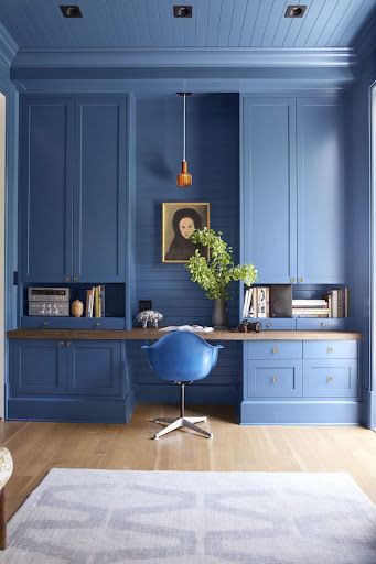
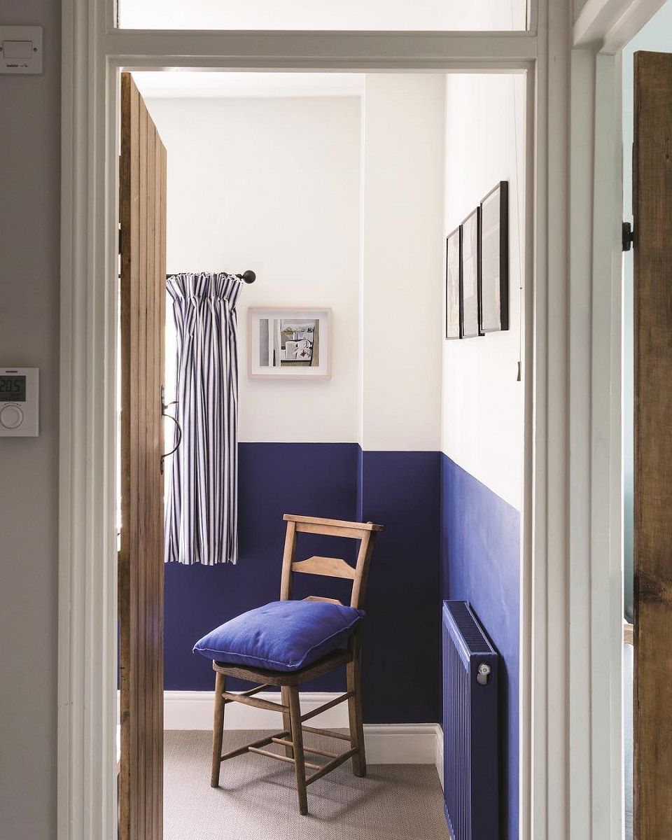
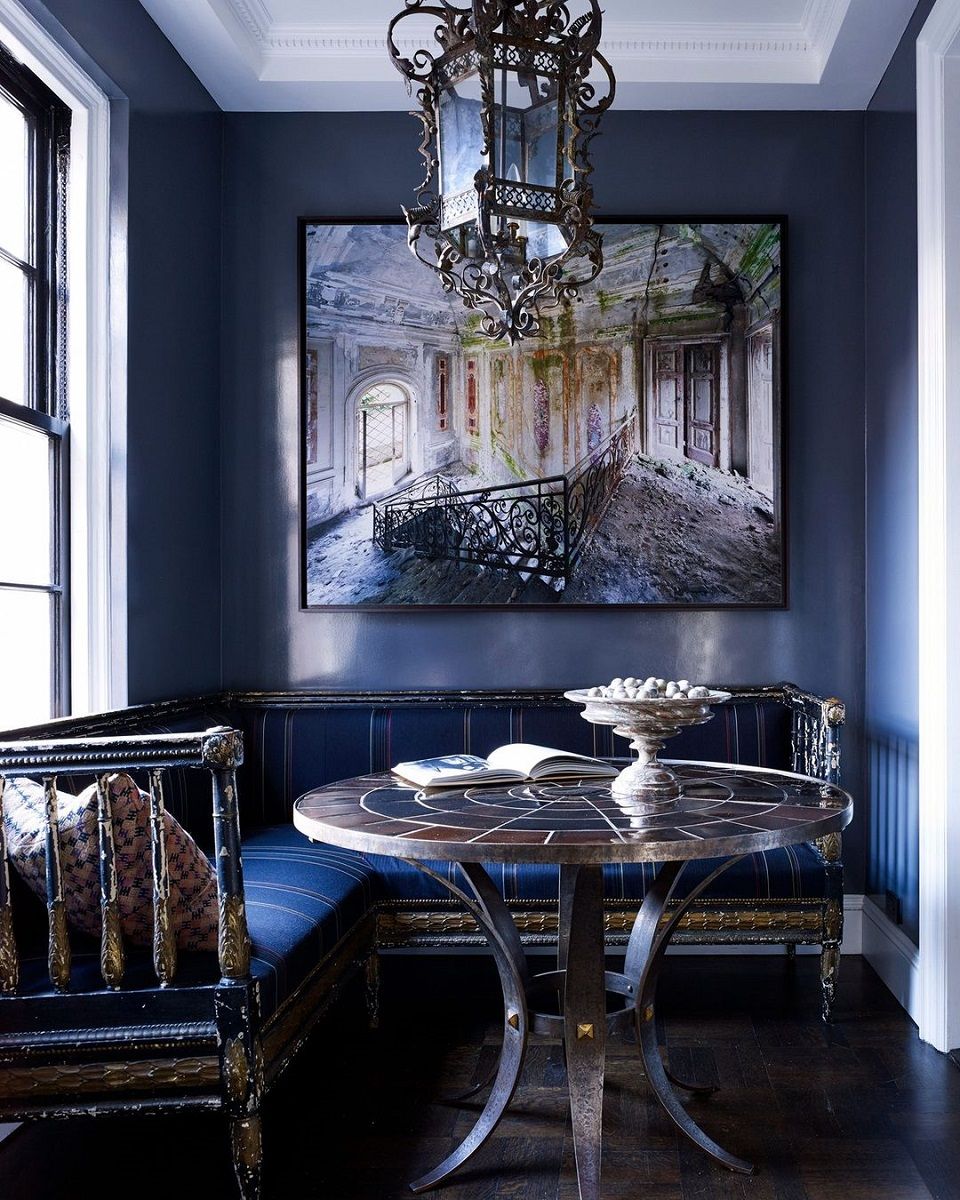
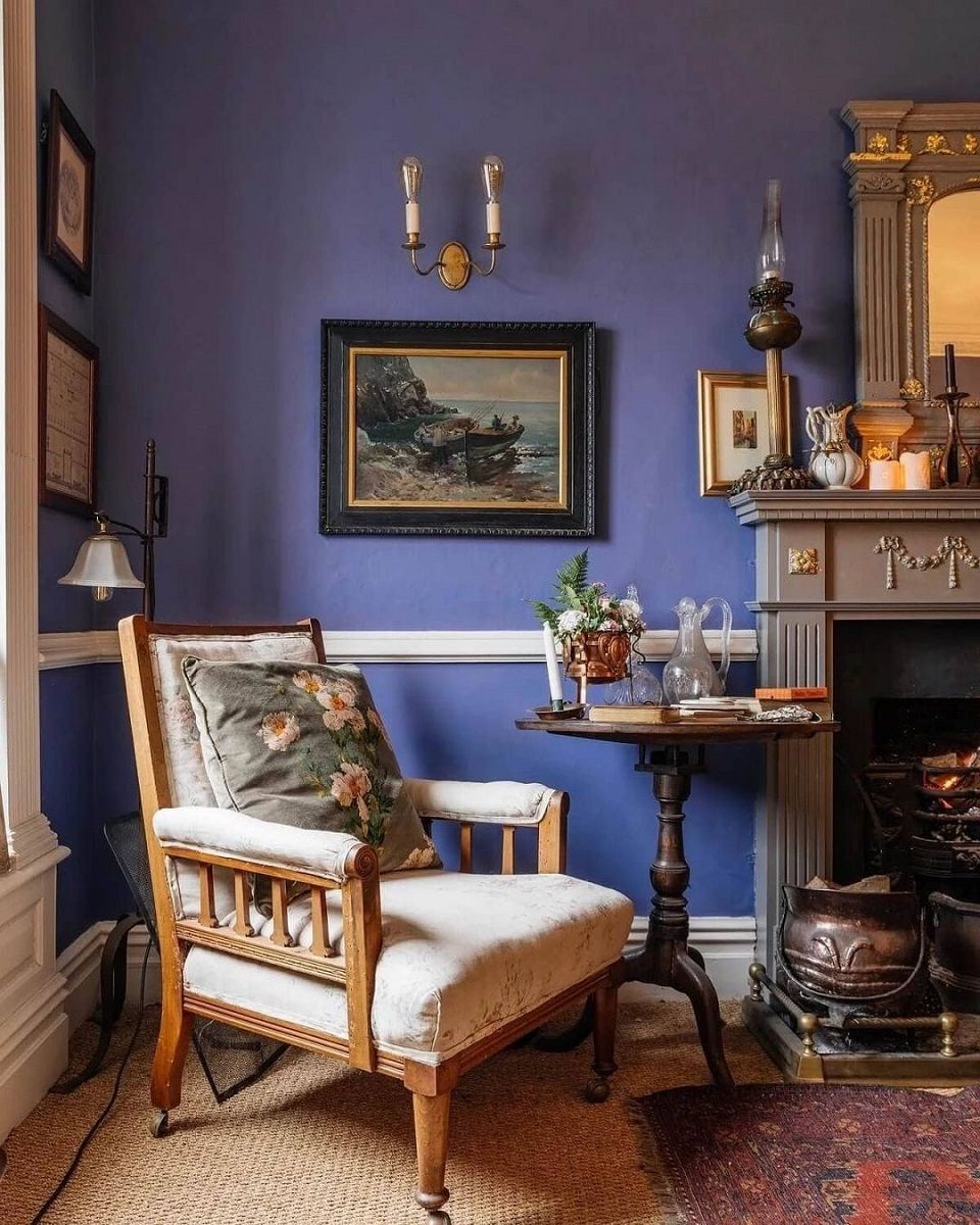
Walls
Very Peri is not only a very versatile shade, but, thanks to its periwinkle blue base, is also good at instilling a sense of comfort and tranquility, and for this reason is highly recommended for rooms such as the living room, bedroom or study. Once you have decided on the room and the match that is right for you, the next decision to make is whether to try painting one or more of the walls in your home. Sometimes a simple color accent is enough to give a room a new twist, so the advice is to try a single one and, if the result is satisfying, continue with the others.
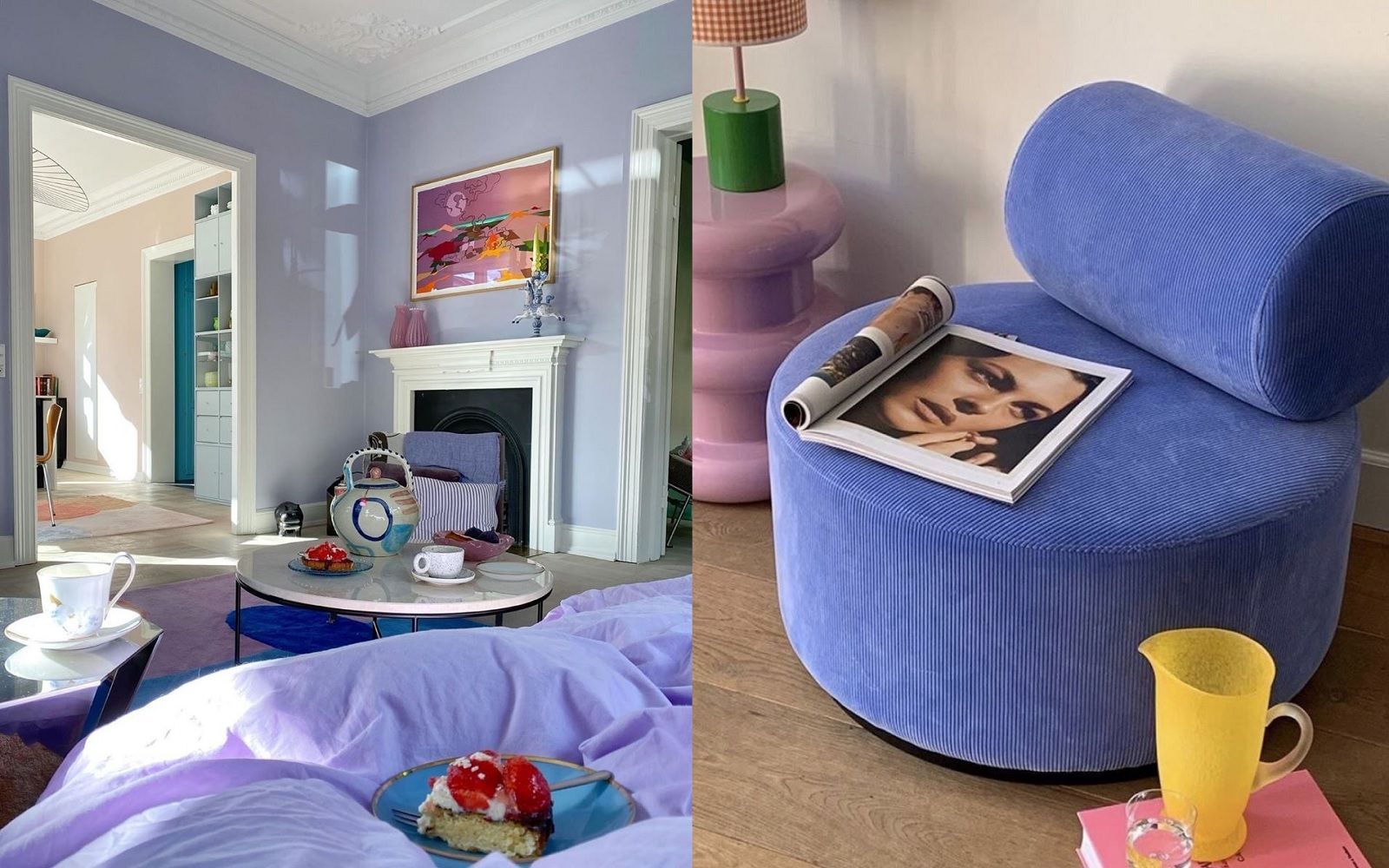
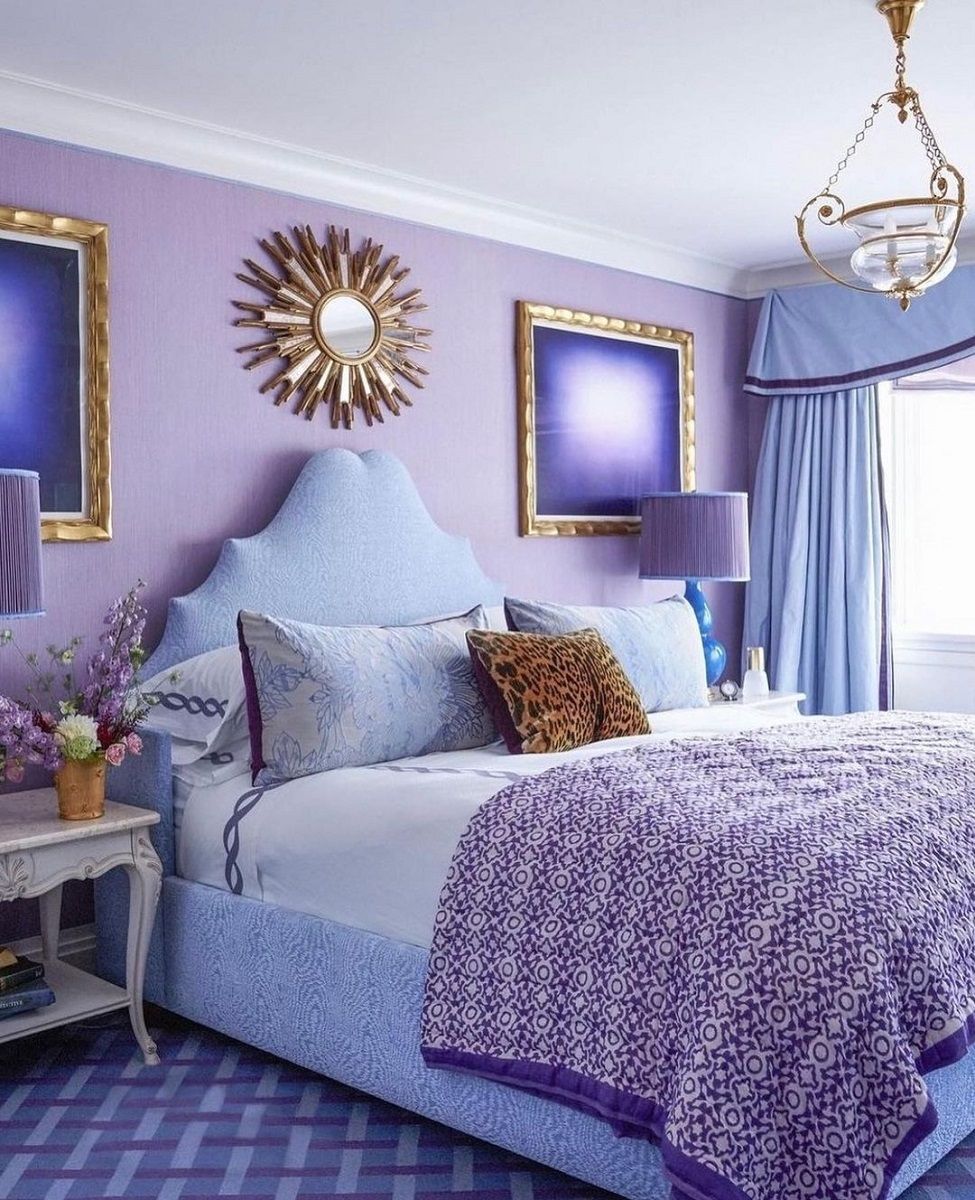
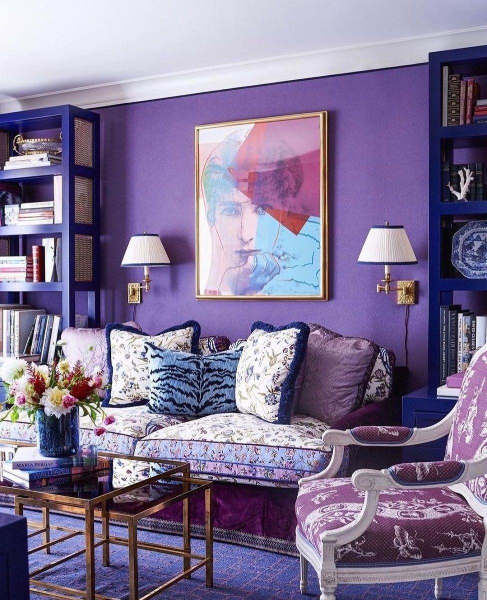
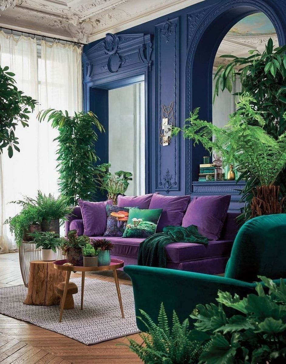
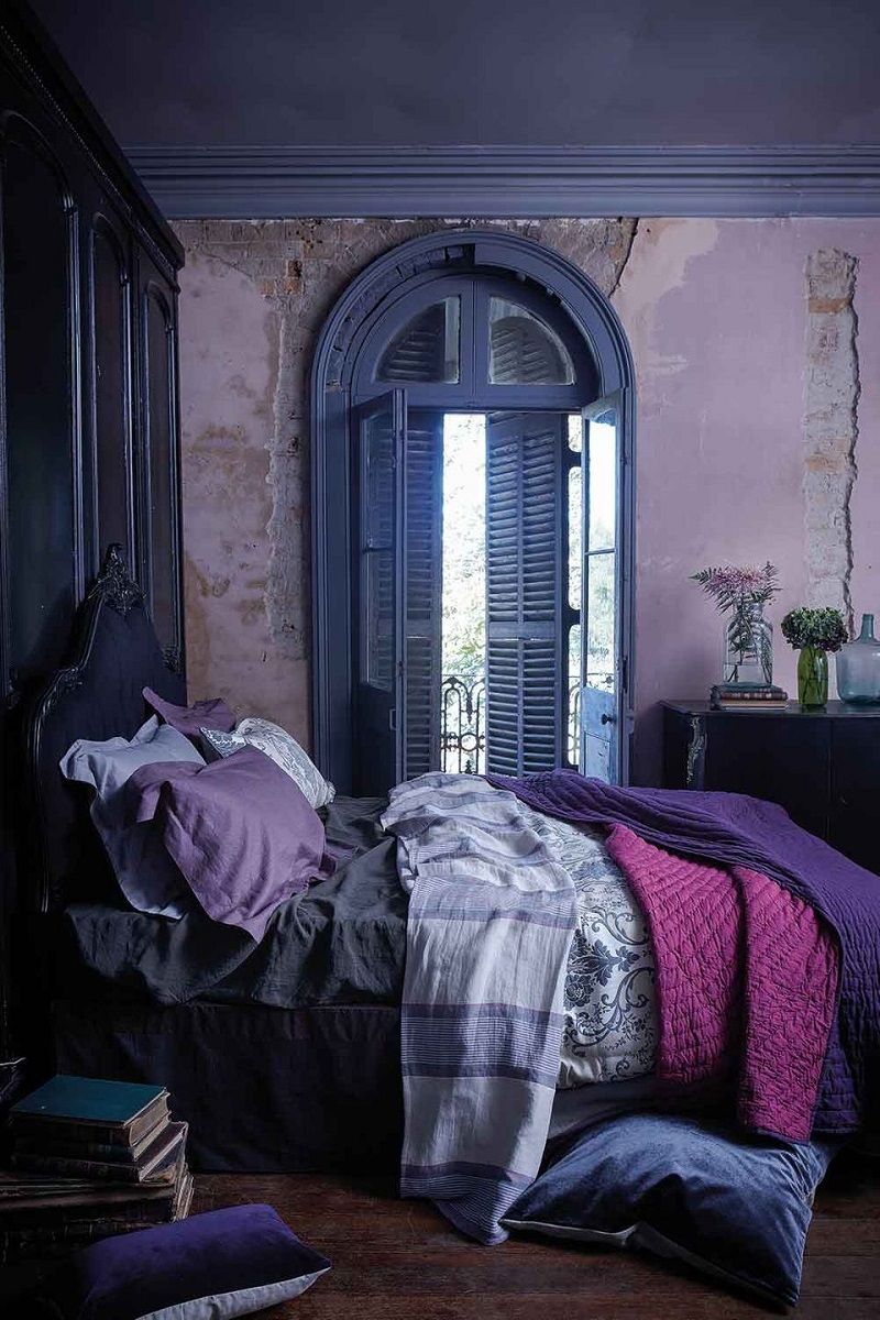
Different shades of purple
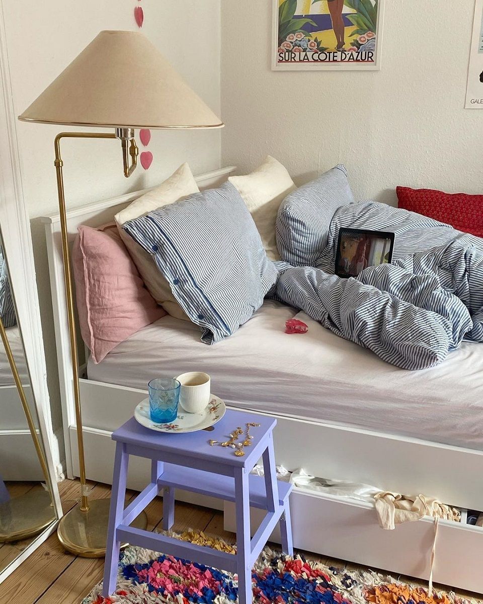
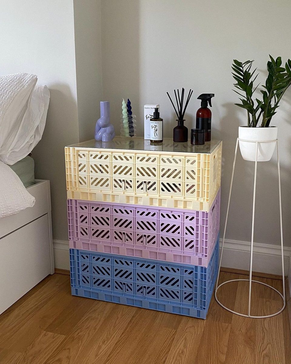
Pantone's Color of the Year is the Very Peri, but its crowning opens the way for a whole series of shades poised between purple and periwinkle blue. If you're looking for a wow effect and aren't afraid to dare the minimalist diktats that revere the zen of a home dominated by neutral hues, then why not play by layering different shades of the same color? Pinterest and Instagram profiles such as @farrowandball, @loveyourhomeuk or @frau.kieselstein offer many ideas on how to recreate captivating environments by adding walls, furniture, plaids, pillows and other small objects of decoration starting from dark purple, passing by Very Peri and arriving up to lilac or wisteria.
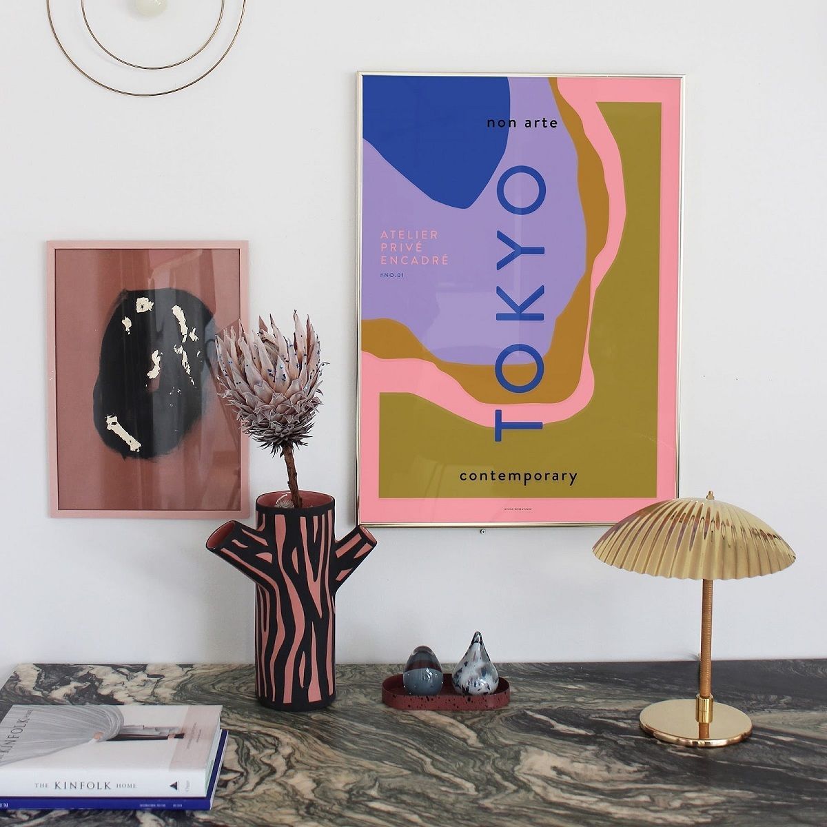
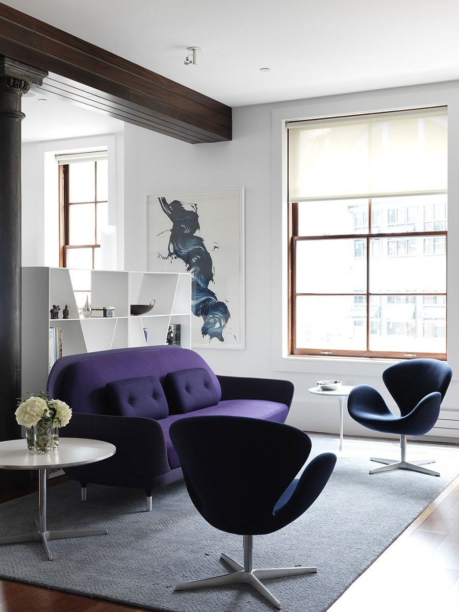
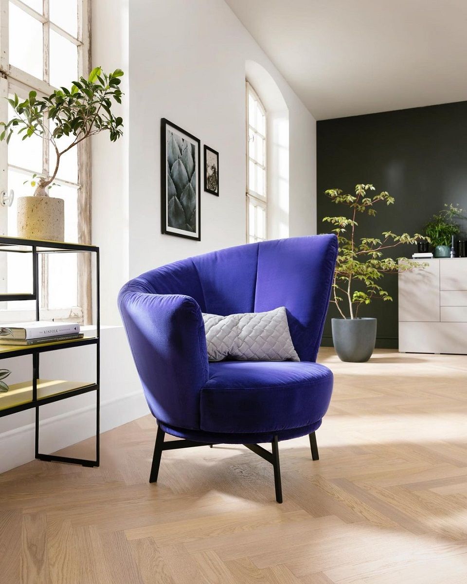
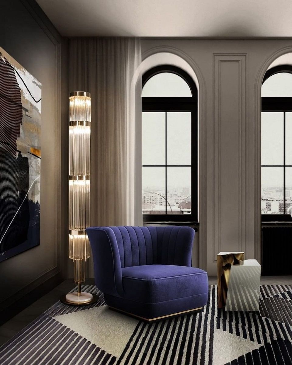
Statement item
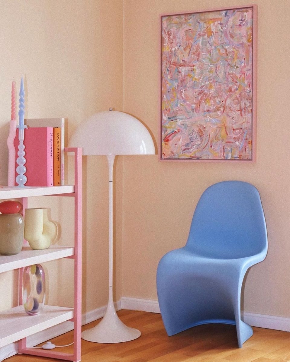
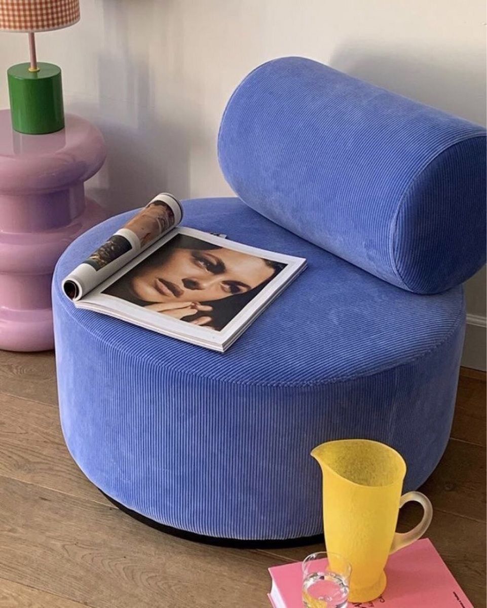
The Very Peri fits well with different styles of decor: from industrial to Scandinavian style, from shabby chic to japandi, even reaching cottage core and cabin core. All you have to do is use it smartly, perhaps focusing on a single statement item, capable of capturing attention and changing the look of living rooms, bedrooms and kitchens. So, instead of opting for the classic neutral tones or colors that are now commonplace, such as green and pink, why not add to your interior design wishlist a Polet armchair by Twils, a Cameleonda sofa, an Easy Chair by Jens Risom or the Admiral cast iron bathtub by Devon&Devon, all in the purple version?
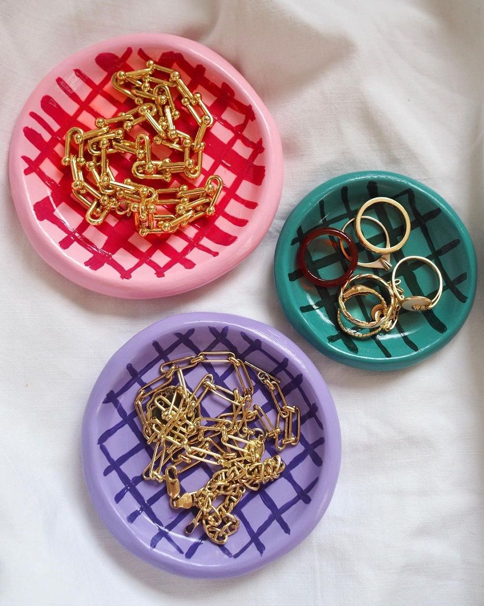
Accessories
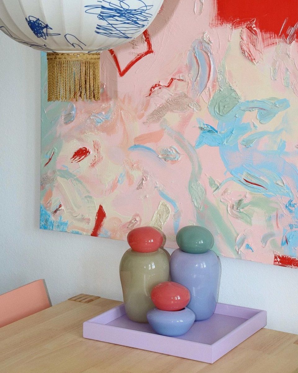
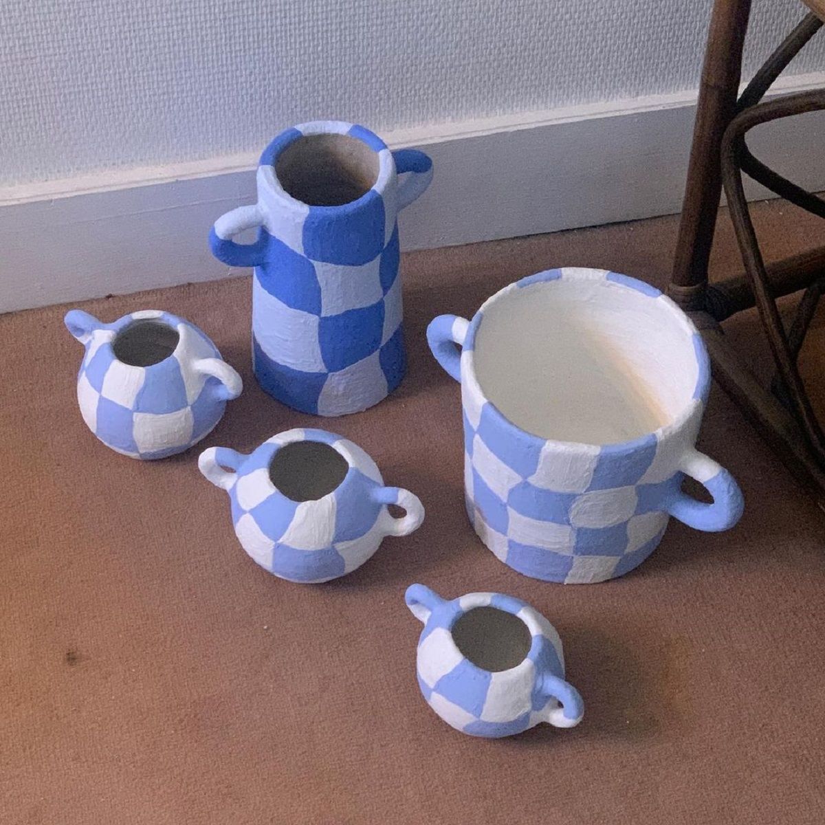
Small accessories like a rug, a poster, a candle, a plaid, a vase, a pillow or a holder. The possibilities are many and different depending on taste and range from twisted candles by Hay to handmade ceramics by @__v_a_l_o_u, from mugs by @staceywallingtonceramics to bowls by @lolamoreau, from rugs by @charlenstudio to vases by @wearetrouva.