The colors of spring 2026 according to Pantone and NYFW From Lava Falls to Burnished Lilac: ten colors and six neutrals to play with fashion
If fashion were a movie, color would be the soundtrack, the one that stays with you and gives you chills even years later. Without it, everything would look flat, predictable, almost boring, like watching a silent film without background music. At New York Fashion Week Spring/Summer 2026, however, color took center stage, turning every runway into a vibrant stage. Pantone, with its much-anticipated Pantone Fashion Color Trend Report Spring/Summer 2026, turned up the volume to the max, presenting a palette that is not just fashion but a declaration of intent. It’s not a list of shades to copy but a true cultural manifesto that speaks of freedom, individuality, and courage. Pantone LLC, rightly defined as the “global color authority and provider of professional standards in the design industry,” signed off on a report that feels like a chromatic revolution. A revolution that doesn’t ask for permission and that, season after season, reminds us that fashion is never neutral but a language through which we tell the world who we are and who we want to become.
A rebellious palette for spring 2026
This year, the message is crystal clear: total freedom. The NYFW SS26 colors are rebellious, “unbound by conventional norms,” refusing to be caged by diktats. Forget the old rules about what matches what: the new mantra is that every combination is possible, as long as it tells your story. There’s no longer “right” or “wrong” when it comes to color, only the ability to express yourself. That’s the heart of this trend: using color as a megaphone, as a mark of identity. While artificial intelligence seems intent on making everything uniform, precise, and standardized, Pantone proposes an explosion of hues that celebrate imperfection and unpredictability, the most human qualities of all. The palette is designed as a joyful barrier against conformity: a bold mix of warm, familiar tones intertwined with vibrant shades, soothing neutrals, and playful accents. Each look becomes a small aesthetic revolution, an invitation to rediscover the joy of dressing without rules and restrictions.
A rainbow with character
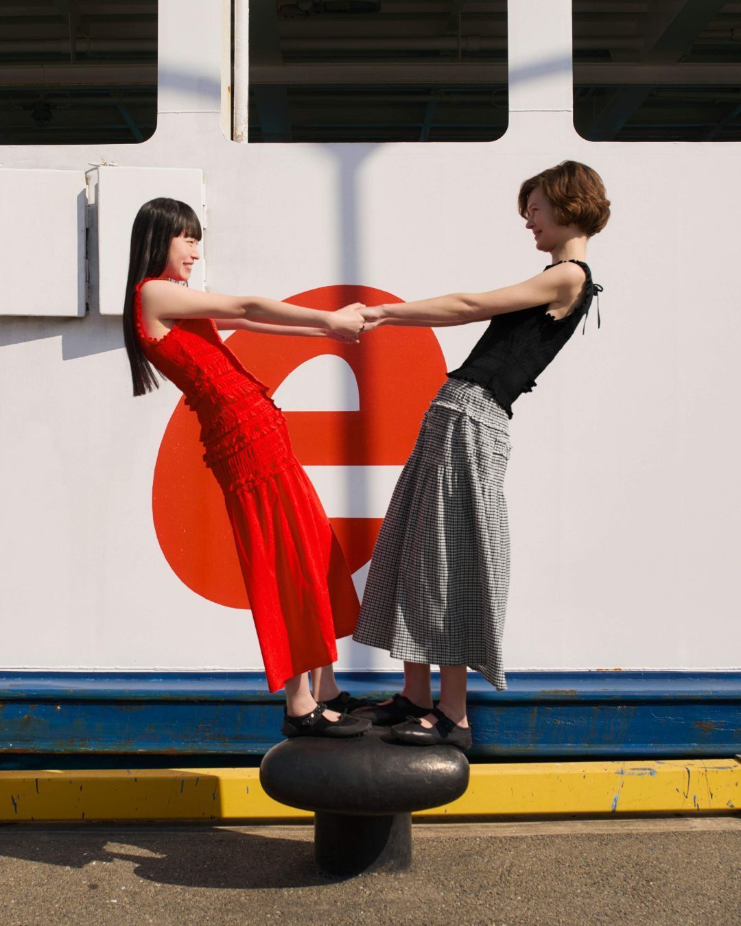
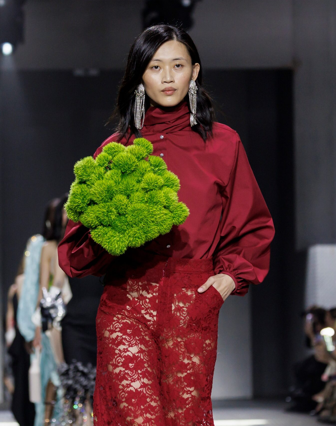
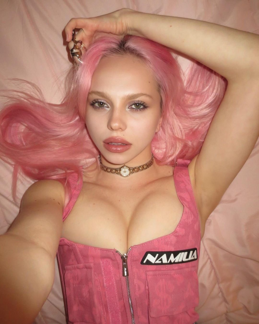
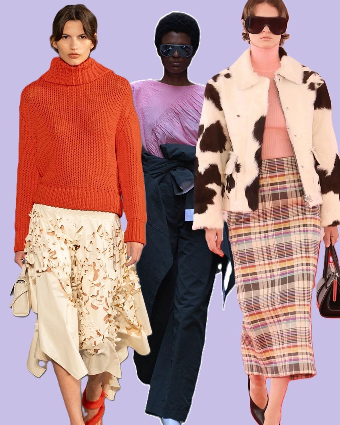
Inside this palette lie emotions, not just colors. There’s Alexandrite, a saturated teal-green, refined and sophisticated, carrying an aura of discreet yet irresistible elegance, like a hidden jewel waiting to be found. Then comes the theatrical blaze of Lava Falls, a fiery red that ignites any outfit and turns even a simple everyday look into a cry of strength and determination. Balancing these explosive hues, White Onyx brings breath and lightness, a luminous white filled with purity and new possibilities, while Sage Green becomes a visual refuge, a shade that soothes and restores like a slow walk among trees and nature. The magic is here: minimalism and maximalism coexisting, conversing, and enriching each other. It’s a mix that reflects the desire to experiment, to combine what seems irreconcilable, to discover new silhouettes and daring chromatic blends. As Leatrice Eiseman, Executive Director of the Color Institute, noted, today’s youth mix stripes, plaids, polka dots, and clashing prints without fear, turning what was once seen as a “mistake” into pure originality.
The magnificent ten
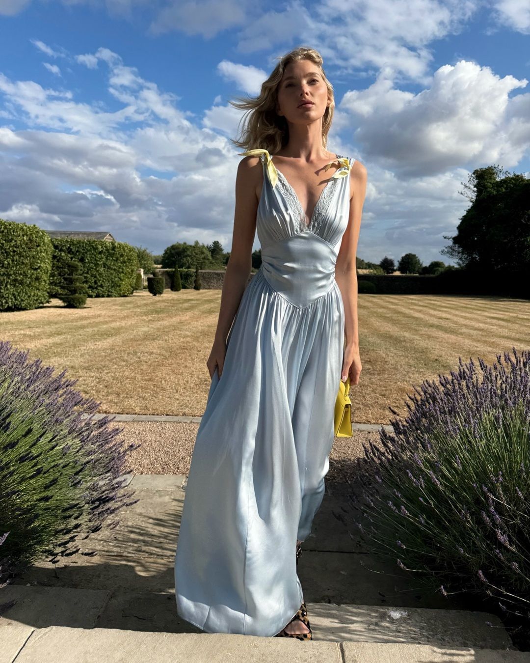
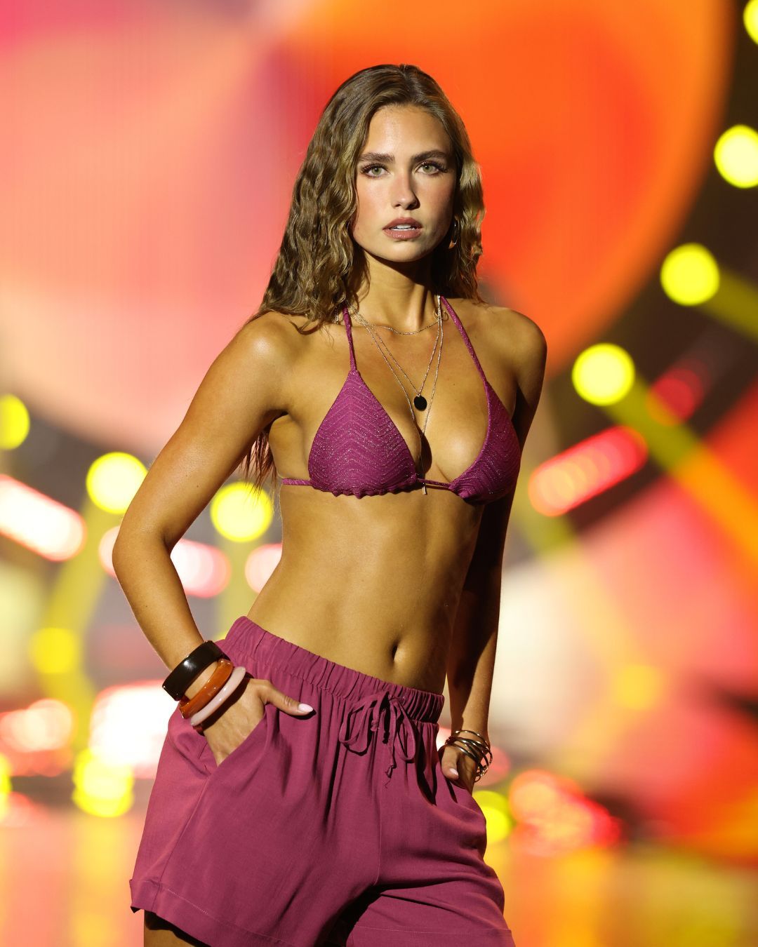
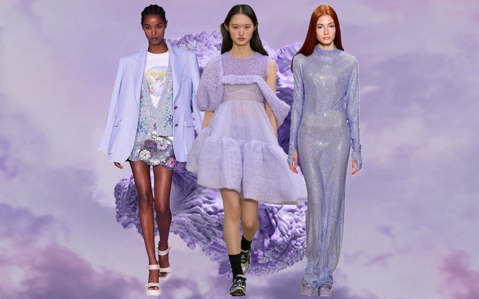
And now we come to the beating heart of the Pantone Fashion Color Trend Report Spring/Summer 2026: the ten star shades. Each with a distinct character, each with a story to tell. Acacia 13-0640 is a brilliant yellow with green undertones, capable of lighting up any combination, especially when paired with Marina 17-4041, a deep, ocean-inspired blue. Then comes Muskmelon 15-1242, a fizzy, vinyl-like orange brimming with energy, just as powerful alone as in bold color play. Alexandrite 18-4835, with its unexpected teal-blue, reminds us that spring doesn’t have to be all pastels: even the most surprising shades can become must-haves. The commanding Lava Falls 18-1552 needs no introduction, it’s the color to wear when you want to feel invincible. Alongside it, two pinks: Dusty Rose 17-1718 and Tea Rose 16-1620, evoking romance and sweetness, yet surprising when paired with stronger tones like Lava Falls. Then there’s the enigmatic Amaranth 19-2410, a deep violet carrying mystery and seduction; Burnt Sienna 17-1544, with its earthy, nature-inspired warmth; and finally Burnished Lilac 15-1905, tinged with nostalgia and vintage charm, a shade that seems to tell stories of the past while reinventing itself in the present.
The neutrals every wardrobe needs
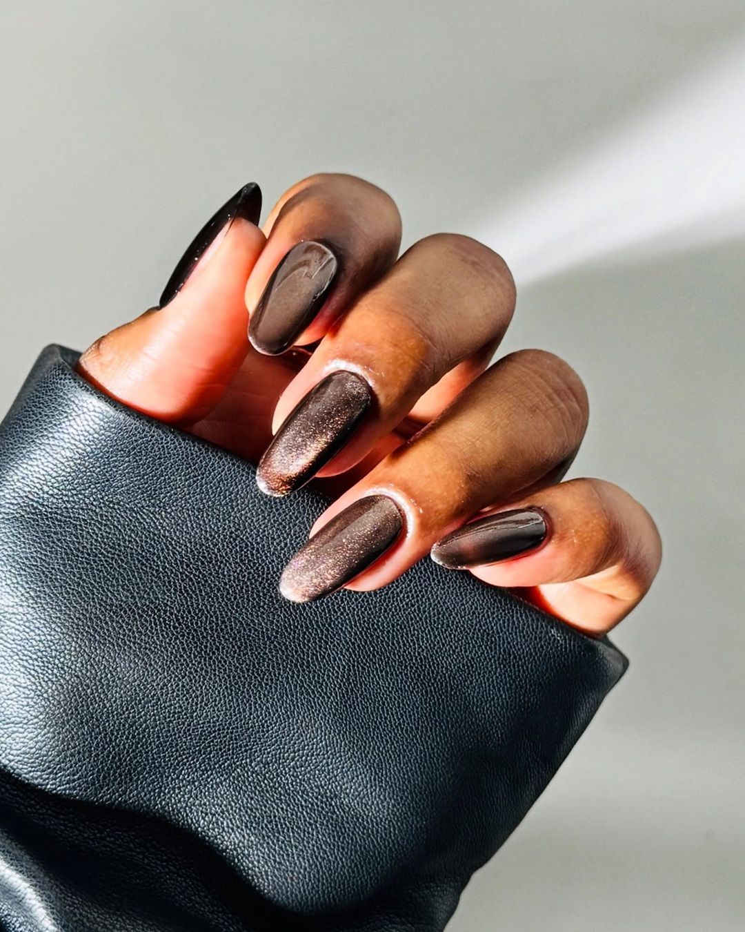
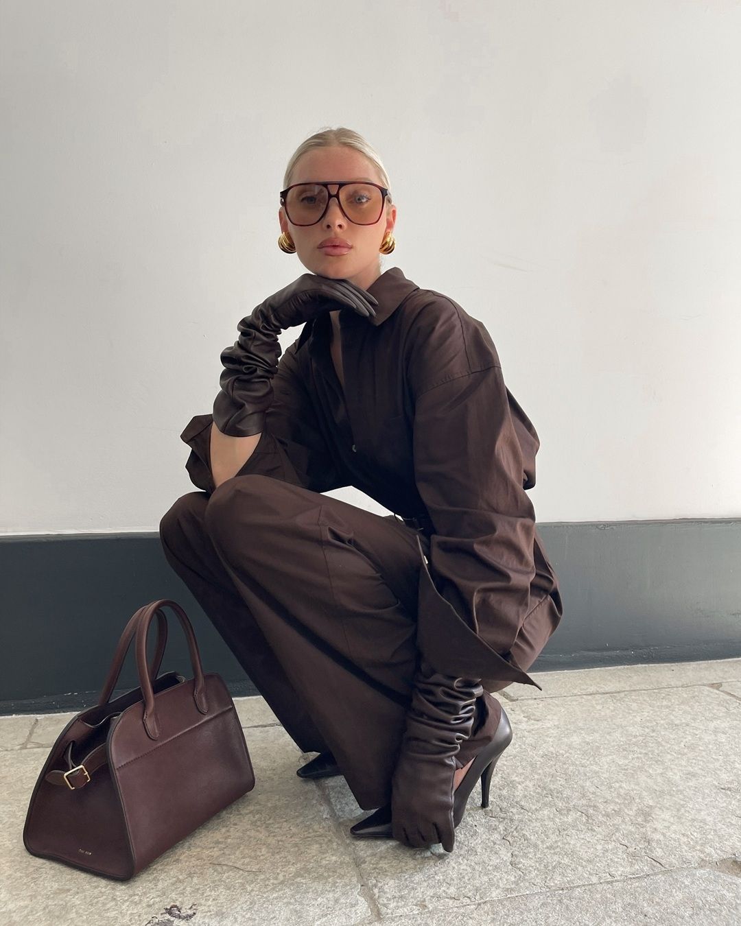
Balancing the palette are six neutrals, carefully chosen by Pantone to provide stability and endless pairing options. Coffee Bean 19-0915 is a velvety, chocolatey brown that gives depth to any look. White Onyx 12-4300, with its luminous clarity, adds breath and brightness. Rhodonite 19-3838 reinterprets navy blue, making it timeless and seasonless. Sage Green 15-0318 becomes synonymous with balance and serenity, while the deep Sycamore 19-5917 recalls the roots of nature, the strength of the forest. Lastly, Angora 12-0605 closes the palette with its tactile delicacy, a soft beige that invites a sensory connection with fabrics. These neutrals aren’t secondary: they are the fertile ground from which the brightest shades can bloom.
Fashion as an antidote to the grey
And while the world outside the runways continues to face turbulent times (with wars raging, tariffs fluctuating, and consumer confidence wavering), fashion responds with irony, courage, and above all, color. The Pantone Spring/Summer 2026 palette becomes an antidote to greyness, a declaration of collective resilience. This is not just aesthetics but a philosophy of life. Wearing these colors is a political act, a personal affirmation that says: “I’m here, I choose, I refuse to bend to pessimism.” It’s the triumph of joyful resistance—the kind that turns the everyday into a celebration, that invites us to rediscover the beauty of small things even when everything feels complicated. So, following Pantone and NYFW’s invitation, let’s dare, let’s mix, let’s play. Because life is too short to dress only in grey.


